Blending Functionality, Design, and Style: A Study in Juxtapositions

Take a closer look at how this restaurant design blended the unique features and functionality of this hotel restaurant.

Functional Harmony
Set in the Colorado Rockies, the Gravity Haus Slope Room does three different things in three completely different ways—all in one space. The coffee and pastry shop, Unravel Coffee, aims to create a sustainable cup that empowers communities and farmers. The energy is cozy but fresh with a hip vibe.
The alpine bistro also embraces a farm-to-table mentality with sustainable Rocky Mountain farms. The vibe has a “sexy and dangerous” Old West allure with a modern twist on the new American steakhouse. The bar spans the room with charm and elegance embracing vintage styling with modern design. It's elegant but has an edge.
They say opposites attract. This is one space that sets functional juxtapositions next to one another over and over again and does it successfully. What brings these three very different restaurant functions together is the design and details. There's a golden thread that stitches it all together into one cohesive function: a place to come together in meaningful ways to connect over some good food.
Inspired? Try This Exact Same Tin Tile: Pattern #12

Fusing Design
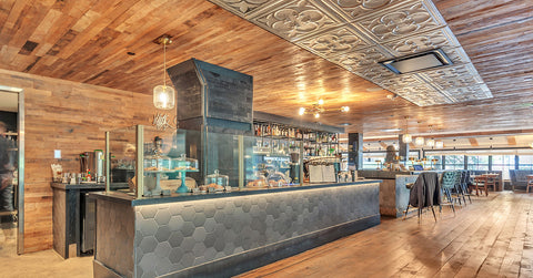
A darker color scheme with gold metallics and mirrors channel a modern feel, cozy mountain lodge feel, and Old West saloon feel all at once. Lighting fixtures vary from ornate metal to tinkling crystal, to bare bulbs but each has a luxe overtone that ties them all together.
Vintage elements like turn of the century mirrored walls, Victorian tin tiles and plush blue velvet echo designs of the past. Hexagon tile, smooth black leather, and minimalism bring a clean freshness. The single design element that brings it all together? The Shou Sugi Ban wood planks on the walls, ceiling, and floors. The Japanese technique of antiquing and preserving wood lends a historic and rustic feel to the space that is the glue that holds it all together.

Combining Styles
The style of the space is hard to describe. It's a collision of history, community, and environmental consciousness. We landed on “vintage cool”. It combines modern with a nod to classic and an overtone of mountain vibe.
The use of Pattern #12, a historic “clover and thorns” tin pattern, does a good job of hinting at turn of the century elegance while blending the Old West elements with the modern ones. Artisan Silver Washed White color has a distressed but tidy feel—a perfect match for this juxtaposed design. The tin tiles are interspersed with the Shou Sugi Ban wood and serve to soften the harder Old West features with a feminine quality.
The Right Stuff
Masters of combining the mountain vibe with all kinds of other styles and designs, studioLEMONADE in Golden, Colorado acted as the architect and interior designer for the space. They took the dimensions and the desired function along with an existing coffee shop brand to create a totally new and atypical space.
R&M Builders headed up the renovation and are still updating the rest of the hotel in segments, a little at a time, so the hotel and restaurant can continue operations.
Hungry for more great restaurant design? These projects will take your breath away.


