Creating Design Atmosphere Is All in the Details

How a space feels is just as important as how a space looks. They are like taste and smell; one is enhanced by the other. The beauty of creating design atmosphere is that it's easy to do. A few details and you can transform a beautiful room into a place that creates its own experience.
For instance, take this hot new restaurant/bar concept in Florida. The combination of Mediterranean seafood, handmade pasta, and custom drinks alone is enough to get some attention and good reviews. But add some atmosphere and suddenly you have an award-winning scene that everyone is talking about.
Speaks Clam Bar is not just built on local, handcrafted food and drink. It's built on the heritage of the Prohibition era and the clam stands that often stood outside the speakeasies of New York City. The dim yet decadent atmosphere is an undeniable part of what made the era so indulgent.
The space was carefully designed to channel that atmosphere but maintains plenty of contemporary features. Guests are on the second floor next to large windows in the center of life on St Armands Key near Sarasota. So how does the Speaks Clam Bar design achieve all that Roaring 20s ambiance? Let's examine best practices for creating design atmosphere a little closer.

Color
Color is one of the easiest ways to elicit an atmosphere. Prohibition era speakeasies were generally dark because they were in hiding. Windows were covered, bars moved into the basement or attic, other businesses fronted for them.
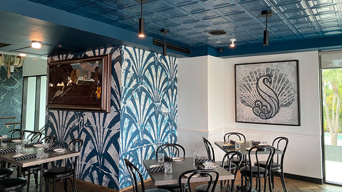
Speaks Clam bar embraces a dark color to help build that speakeasy atmosphere. A dark ceiling and darker walls all in the same color creates a sort of closed-in feel that makes the intimate atmosphere. The moody blue colors skirt the line between a truly dark color and a more vibrant color that blends the history and contemporary into one feel.
Lighting
Nothing creates atmosphere like the right lighting. Minimal light in Speaks enhances the ambiance of the space. At night, when the bar is the place to be, glass walls that open onto the balcony let in the twinkling lights and vibe of St Armands Circle.
Artwork
The artwork of Speaks tells a story. The Prohibition motif increases the atmosphere exponentially. The 20s era art and photographs along with newspaper headline murals, announcing the end of Prohibition, bring that story to the forefront. You can live inside the era vicariously with the atmosphere-inducing art.
Historic Authenticity
Adding authentic elements to the space immediately brings the atmosphere to life with history. Lighting fixtures give a nod to original designs of the time. Furnishings hearken back to the era as well. The highlight of historic authenticity at Speaks is the tin tile ceiling.
Tin ceilings were a popular design element from the late 19th century through the late 1930s. The use of tin ceilings channels the Roaring 20s better than any other feature of the space. Pattern #1 is a concentric square design that suits the aesthetics of the 20s well, a perfect choice for Speaks' atmosphere.


