Passionate Italian Design Principles in Action in Boca Raton

In Midtown Boca Raton, Florida, “Restaurant Row” is the center place of upscale dining. It opened in the summer of 2023 and features creative food concepts, diverse flavors, and Michelin-star chefs—one of which is Fabio Trabocchi, owner of several Italian restaurants in NYC, DC, Miami, and now Boca Raton.
Fiolina is a pasta restaurant that carries on the tradition of an Italian woman’s handmade pasta. In Italy they are called “sfoglinas..The pasta is made on site and visitors can even watch in the “pasta room.” The restaurant also features a full bar full of artisan cocktails and Italian wines.
Seemingly just as important as the impeccable food and drink, the design of the space deserves attention as well. It is an understatement to say that the space is bold, passionate, and design-forward—quintessentially Italian.
EDG Interior Architecture, the design firm, took chef’s vision of creating a dining destination and brought it to life. “Imaginative, fun-forward, and fantastical, [a design] that would transport guests from the everyday” was the aim. Designers landed on “sfoglina meets Fiorucchi,’where traditional rolling pins and kitchen aprons mix with cheeky fashion ads from the Italian fashion designer and bold Murano glass lighting”, said Patrick O'Hare, AIA, VP of EDG.
Let’s take a closer look at a few elements that set this space apart.
Pattern Layering
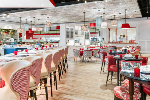
Everywhere you look in Fiolina there is a new pattern to discover. The floor features patterned ceramic tile and custom patterned mosaics. The walls have different floral wallpapers and 3-D subway tile placed vertically. Textiles vary from floral to geometric. Even the pendant lights have shades in all different solids, stripes, and florals.
Last but not least, the ceiling over the main dining area features two different patterns of tin tiles. All those patterns blend together yet still stand out, a feat of design that is more art than anything else.
How does it come together harmoniously instead of chaotically? Color. Red, gold, blue, and green on white and light woods ties all the patterns together and makes the space feel cohesive.
Tips for Layering Patterns
- Start with a Neutral Base
Stick to solid, neutral colors as a calm backdrop then add layers of patterns.
- Mix Pattern Scales
Combine different sizes of patterns to avoid a cluttered look.
- Vary Textures
Adding texture helps break up patterns and prevents the design from feeling flat, giving the space a more luxurious and layered feel.
- To prevent patterns from overwhelming the space, use solid colors as buffers between different patterns.
Keep Things Bright
Many restaurants go for a moody, romantic type lighting. The dimness makes it feel more intimate and private. Not so in Fiolina’s design. It is bright, airy, and open. This is another element that allows the bold colors and many patterns to work well in the space.
The brightness creates a sense of space and leaves the door open for lots to happen with the design. Evenly spaced recessed lighting is spread across the entire space. Sconces grace the nooks and crannies.
Pendant lights and chandeliers hang over the eating spaces. Lamps stand guard over the bar and food stations. Nuanced lighting adds highlights to shelves, decor on the walls, and the bar. Iin place of a single candle on each table, there is a miniature lamp.
Tips for Lighting
- Layer lighting
Use a combination of ambient, task, and accent lighting to create depth and versatility in a room.
- Mix Fixture Styles
Combine various styles of light fixtures (e.g., chandeliers, pendant lights, floor lamps) to create a dynamic look.
- Prioritize Natural Light
Maximize natural light by using sheer window treatments or strategically placing mirrors to reflect sunlight.

Define Spaces
Though Fiolina is mostly one large space, it is broken up into smaller spaces for private event rentals. Minimal physical dividers help do this, such as several different bar spaces and bench seating. It is also done with decor.
Different pattern themes and emphasis on different colors in the scheme accomplish divides too. Furnishing styles differ from space to space as well.
The most definitive space is the main dining room, which is defined from above with a tin tile ceiling. Two patterns (Pattern #2 and Pattern #6) in Artisan Copper Washed White enhance the brightness of the space with a bold and elegant finish. Though there are no walls, the ceiling delineates the boundaries of this space effortlessly.
Tips to Define Spaces without Walls
- Use Rugs
Rugs are a great way to visually define different zones, like the living room or dining area, within an open space.
- Incorporate Strategic Lighting
Pendant lights over a dining table, a chandelier in the entryway, or task lighting in a work area can help create a sense of separation between zones while contributing to the overall ambiance. - Arrange Furniture
Use furniture placement to divide spaces naturally. A sofa with its back to a dining area, for example, can help define the living room.
Why Tin Tiles? A Note from the Designer
“Tin tiles are both timeless and contemporary, so they really fit the bill for this project. They also add fantastic texture and the metal provides a nice counterpoint to the soft fabrics, pillows and wallpapers we used in the space. In the main dining room they create a wonderful punctuation in the main space and provide a wonderful frame for the overhead lighting used in the space.”
See what other designers are doing in other stunning projects.


